David Carson’s Influence on Contemporary Typography
Introduction
David Carson is one of the most influential and controversial figures in modern typography. Known for challenging the boundaries of legibility and traditional design rules, Carson redefined how type could express emotion and meaning. His experimental and chaotic layouts rejected the polished, grid-based norms of the late 20th century and paved the way for a new, more expressive form of visual communication. Carson's approach to typography has made him a cultural icon whose work continues to inspire designers around the world.
Career Development
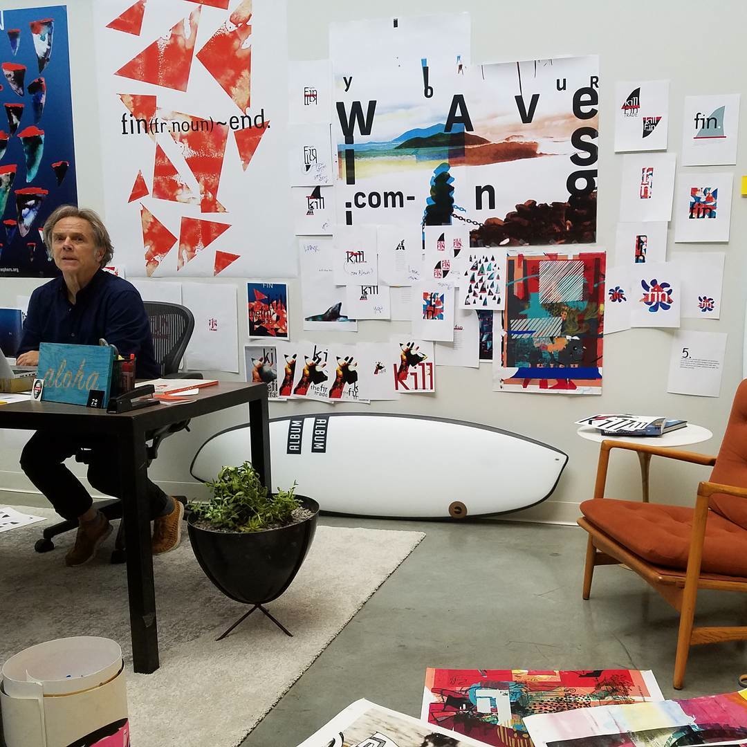
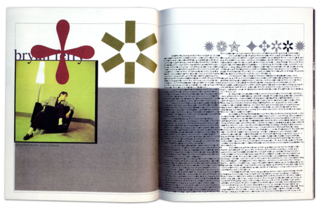
Carson began his professional life as a high school teacher before pursuing graphic design in earnest. Though he lacked formal training in design, his background in sociology and surfing played a major role in shaping his unique aesthetic. Carson gained recognition in the 1990s as the art director of Ray Gun, an alternative music and culture magazine. His work at Ray Gun pushed the limits of legibility and conventional layouts, famously using Zapf Dingbats to publish an unreadable interview with Bryan Ferry—because he found the content boring. This bold, rule-breaking attitude became the hallmark of his career, establishing him as a pioneer of what would later be known as grunge typography.
Carson's influence on typography lies in his refusal to prioritize clarity over emotional impact. While traditional designers stressed clean lines and easy-to-read typefaces, Carson emphasized feeling and personal connection. He deconstructed type, stretched and overlapped letters, and ignored conventional grid systems. This led to the rise of the grunge design movement, which embraced raw, organic, and often messy visuals. Carson showed that typography wasn’t just about delivering information—it could also be a powerful tool for storytelling and self-expression. His work encouraged a generation of designers to break away from strict rules and explore typography as an art form.
Defining Grunge Typography: Carson’s Most Significant Contribution
While David Carson did not create a specific, widely-used digital typeface, his most significant contribution lies in his typographic philosophy and his radical editorial layouts, particularly during his time at Ray Gun. Carson’s work at the magazine featured groundbreaking visual experimentation—distorted type, erratic alignments, and unconventional kerning. His design choices were not just stylistic but conceptual, pushing readers to "feel" the content rather than just read it. His manipulation of typefaces like Helvetica, Zapf Dingbats, and others showed that even existing fonts could be transformed into emotional and visual experiences when used with intention and boldness.
Impact on Typography
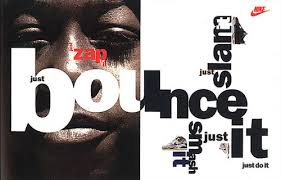
Carson’s design legacy isn’t based on inventing a new typeface—it’s rooted in how he used typefaces. By rejecting design orthodoxy and embracing intuition and experimentation, he elevated typography into an expressive language. His impact was felt across print media, advertising, branding, and even motion graphics. He influenced major brands like Nike, Pepsi, and Microsoft, who hired him to bring that raw, unconventional energy into their campaigns. Carson’s approach reshaped how designers thought about type—no longer just a vessel for words, but a medium capable of emotion, contradiction, and disruption.
Legacy and Influence: Carson’s Lasting Impact on the Field
Educational Contributions
Despite not having a traditional design education himself, Carson has become a major educational figure in the world of typography. Through lectures, workshops, and interviews, he has encouraged students and emerging designers to trust their instincts and embrace experimentation. Carson’s story proves that powerful design can come from unconventional paths, and that formal training is not a prerequisite for creativity. His emphasis on emotional intelligence, cultural awareness, and visual intuition has helped reshape modern design curricula and inspired many to pursue design as an expressive and personal craft.
Carson advocates for a form of typographic excellence that transcends technical perfection. For him, excellence is defined by authenticity, innovation, and emotional resonance. He has consistently spoken out against design that is “too clean” or “too safe,” arguing that such work fails to connect with audiences on a deeper level. By championing bold visual storytelling and emotional engagement, Carson redefined what excellence in typography means—not just clear communication, but memorable and meaningful design.
Typeface Analysis: Deconstructing Carson’s Typographic Design
Background and Development
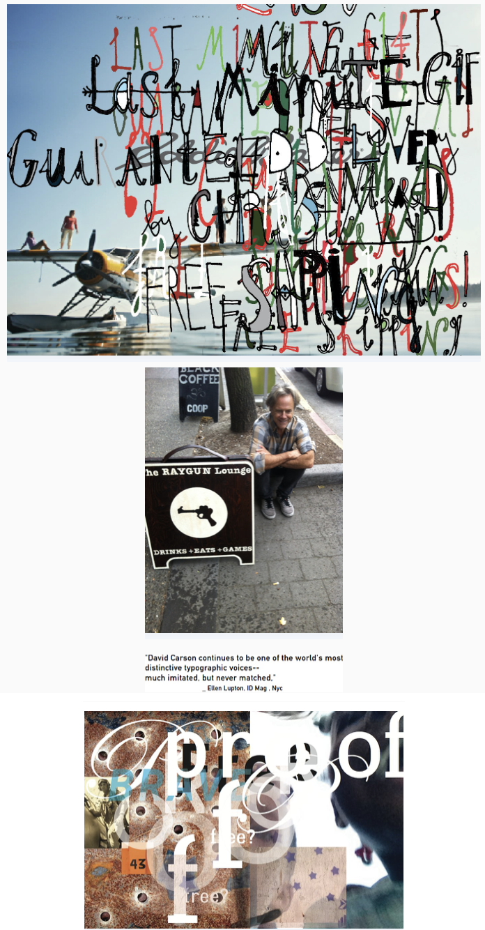
David Carson’s most famous use of typography wasn’t the creation of a new typeface, but rather how he deconstructed existing ones. One of his most iconic moments involved replacing readable type with Zapf Dingbats in an article because he found the text dull. This subversive move reflected Carson’s belief that the form should reflect content—and sometimes, lack thereof. He frequently used and altered typefaces such as Helvetica, intentionally pushing them past their legible limits to reveal new emotional dimensions.
Typographic Style
Carson’s typographic style is defined by distortion, fragmentation, asymmetry, and unpredictability. He layered text on text, blurred letterforms, and allowed words to break outside traditional margins. His designs often evoked the look and feel of collage, graffiti, or street posters—gritty, tactile, and unrefined. These characteristics gave rise to the grunge typography movement, which valued personality and imperfection over structure and clarity.
At the time, Carson’s work was polarizing. Critics accused him of abandoning readability, while others praised his fearless originality. Over time, his work was recognized as visionary. It opened the door for designers to take creative risks and embrace imperfection. Today, his influence can be seen in editorial design, album covers, streetwear branding, and digital art. Carson's visual language redefined how typography could communicate mood, tone, and attitude.
Visual Language and Disruption: A Carson Composition Analysis
Design Inspiration
Carson drew design inspiration from music, surfing, and subcultures. The influence of these elements can be seen in his aggressive, visceral typography that aims to disrupt. He embraced the chaos of punk rock aesthetics and combined them with traditional editorial principles, resulting in innovative typographic layouts that challenged norms and stirred emotions.
Carson’s use of dissonance in layout design gave his work an emotionally intense quality. Whether through off-kilter text, overlapping fonts, or excessive white space, Carson's layouts never allowed for a passive viewing experience. Every element was intended to challenge, engage, and provoke.
References
- David Carson: Biography, designs and facts. Famous Graphic Designers. (2014, July 10). https://www.famousgraphicdesigners.org/david-carson#google_vignette
- Flaxendream. (2015, January 26). Quiet dream. Tumblr. https://lightsideinhabitant.tumblr.com/post/109161546568/cyclops-1994-albert-watson-designed-by-david
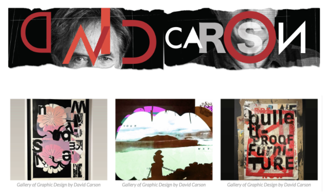
- Gallery of Graphic Design by David Carson. VisualArtsMagazine, www.artymag.ir/en/galleries/QAlt/. Accessed 22 Mar. 2025.
- Linktr, ugc.production.linktr.ee/7408272a-53ac-4010-bdde-4072a666f850_00.Workbook.pdf. Accessed 22 Mar. 2025.
- Miranda, Paul. “David Carson: Surfing the Unconventional Waves of Zapfs Dingbats.” Medium, Medium, 27 June 2020, medium.com/@yopaulmiranda/david-carson-surfing-the-unconventional-waves-of-zapfs-dingbats-52a520186c64.
- Revolutionary, risk-taker, Pro Surfer: David Carson. newmancdENGL460. (2013, October 22). https://newmancd.wordpress.com/2013/10/22/revolutionary-risk-taker-pro-surfer-david-carson/
- “The End of Print.” Google Books, Google, books.google.ca/books?hl=en& lr=&id=_19gFAumiQ4C&oi=fnd&pg=PP111&dq=David%2Bcarson&ots=1Rj-BqOs7L&sig=8NhcZ-AtUdxg_PdMYyNpnsQQw20#v=onepage&q=David%20carson&f=false. Accessed 21 Mar. 2025.
- “Typographic Design.” Google Books, Google, books.google.ca/books?hl=en&lr=&id=LzqsBgAAQBAJ&oi=fnd&pg=PR22&dq=david%2Bcarson%2Btypography&ots=RuC0IWkT_t&sig=8-hO7XLAlhzy3-JDn_kbITauTS0#v=onepage&q=david%20carson%20typography&f=false. Accessed 21 Mar. 2025.